We are a design and innovation consultancy with a focus on strategy and storytelling.
We embed ourselves into our clients’ world, using a multi-disciplinary approach to guide them through the process.


Case Study
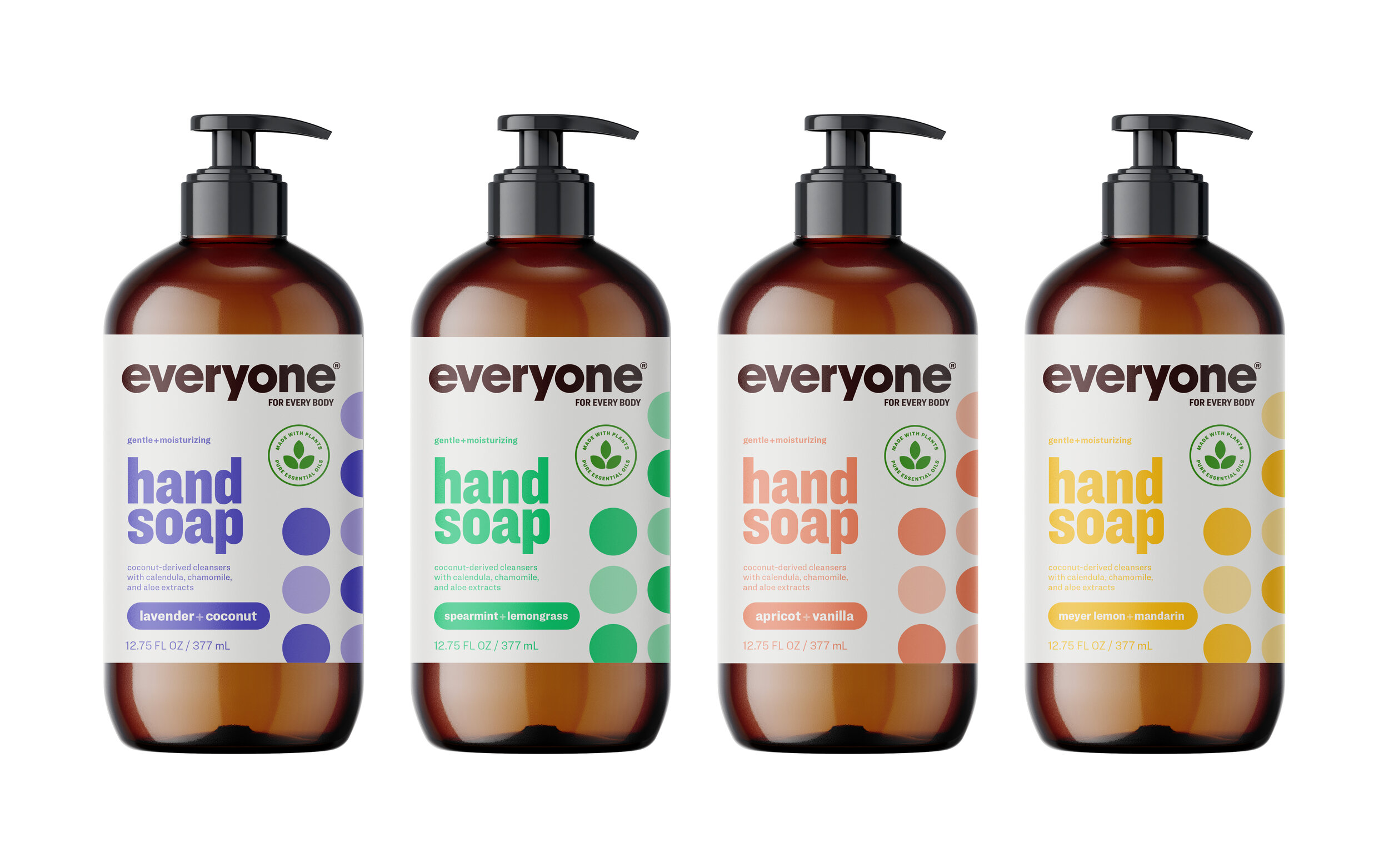
Everyone Redesign
Challenge
The Everyone brand is part of the EO products company founded in 1995. Content BK was invited to help in the foundational brand transformation and formation of the brand studio for both EO and Everyone.
The Everyone brand redesign was the business priority with the goal of mass category expansion. With about a decade in the market, the Everyone brand had presence in both the naturals and mass channels but was still a challenger brand and lacked brand appeal, often mistaken for a generic brand.
Solution
It was a priority for the redesign to establish the Everyone brand as high quality, as well as cue its naturalness.
The timeless monochromatic dots and color palette are design elements inspired by modern art and a nod to the founders philosophy of simplicity and approachability. The dot pattern also solved the brand’s desire to communicate scent ingredients without using illustrations.
Results
The Everyone brand redesign is the first complete redesign since its initial launch. The new brand ID and packaging redesign brought a lot of excitement both internally and externally and has influenced the visual language across all touch points. The new design is currently launching across North America at Target, Whole Foods, Walmart, grocery outlets and Amazon.


Case Study
Nestlé Sensations
Challenge
The flavored milk space is a billion dollar category with a solid 3 year growth rate, lead by the explosion of protein and indulgent Ready-to-Drink beverages. The challenge was to create a crave-able brand for a new line of Nestlé Sensations branded and co-branded indulgent beverages that breaks through the cluttered shelf and communicates clearly what the product is.
Solution
For the Nestlé Sensations brand we developed a range of attributes that communicated delight, indulgence, nostalgia and sensorial experiences, all wrapped up with the rewarding benefit of joyfulness that one gets from eating their favorite dessert or drinking their favorite beverage. There’s no better way to communicate joy than that of a smile. It’s a universal symbol for happiness and joy. The Sensations logotype is custom designed to telegraphically communicate the shape of a smile.
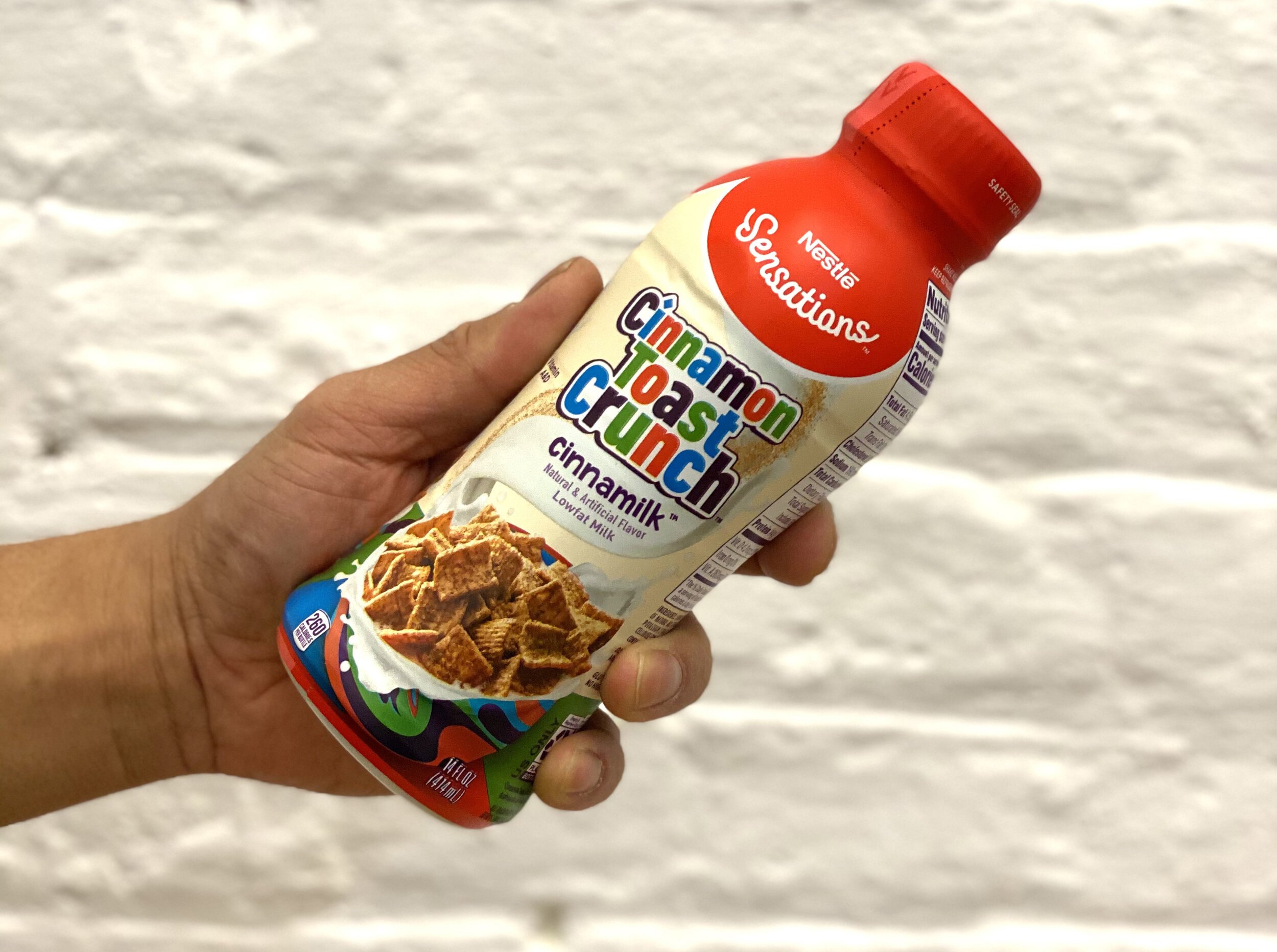
We worked closely with the Nestlé team to strike the perfect balance: making sure the co-brand was the main design feature on front of pack but it was clear that this product is made by the Nestlé Sensations brand, thus qualifying the equity Nestlé plays in the dairy/milk category.
Results
Nestlé Sensations launched its first product at the beginning of 2021 with the co-branded Cinnamon Toast Crunch Cinnamilk. The launch has been well received nationwide at Walmart and several C-store outlets and it’s been hard to keep up with inventory.
Logotype design: Greg Lindy / Lux Typo
